#ecommerce
#mobile
#Figma
Figma
Address food deserts by providing quality groceries to underserved areas
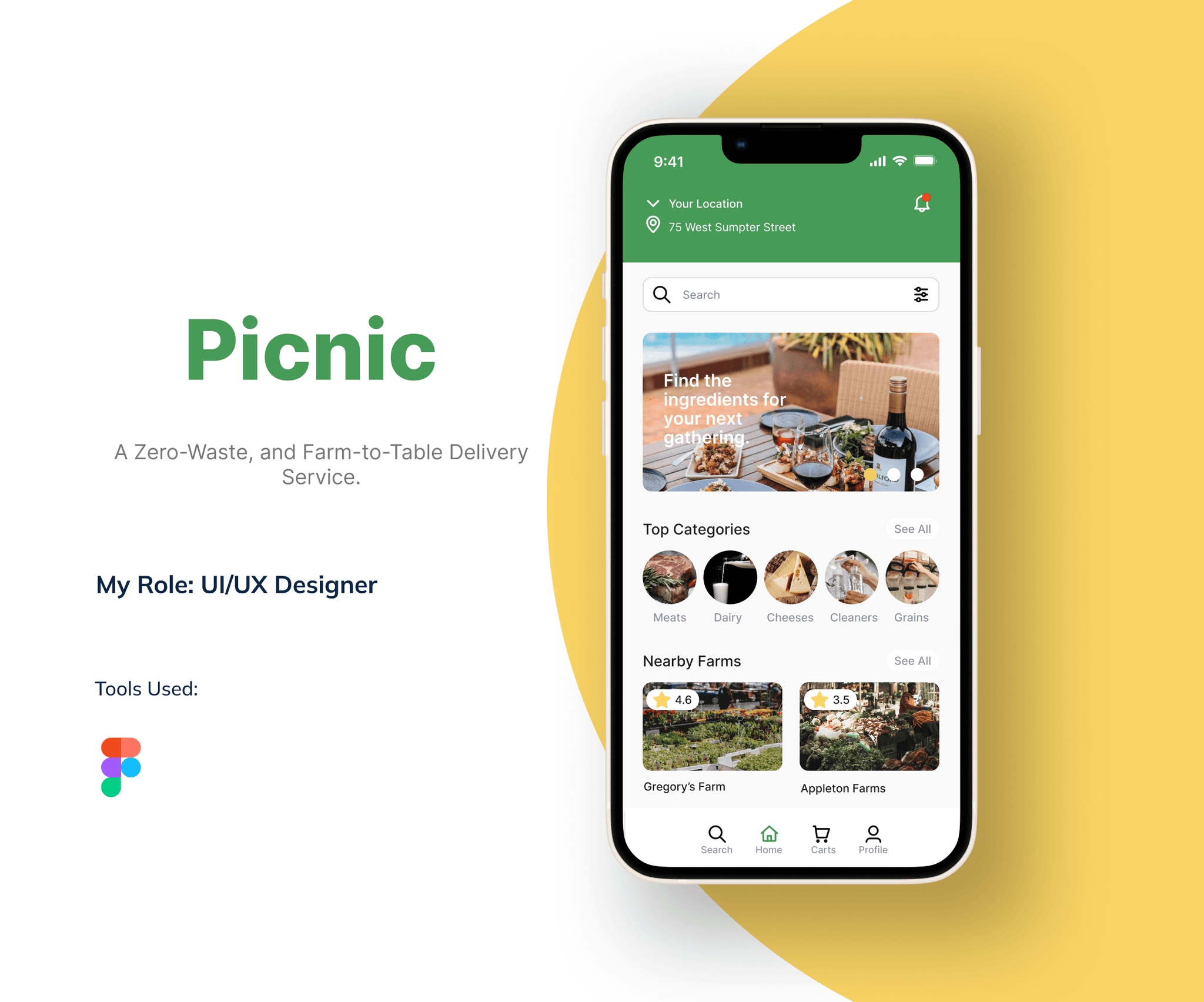
Picnic strives to address food deserts by delivering farm-to-table products to underserved areas. The app ensures convenient access to nutritious and sustainable options, promoting a zero-waste approach. Through quality groceries, Picnic contributes to improving community health and well-being with environmentally conscious delivery of fresh, locally sourced produce.
After doing research from outside sources, I have confronted several instances in both rural and urban settings about how food and farm-to-table products affects them.
Direct connection with growers when buying from farmers
Local and fresh product appeal from farm-to-table products
Rural residents more aware of farm stands and PYO operations
Urban residents have easier access to farmers markets than originally speculated
Over 23 million Americans live in food deserts
Limited access to good grocery stores in food deserts
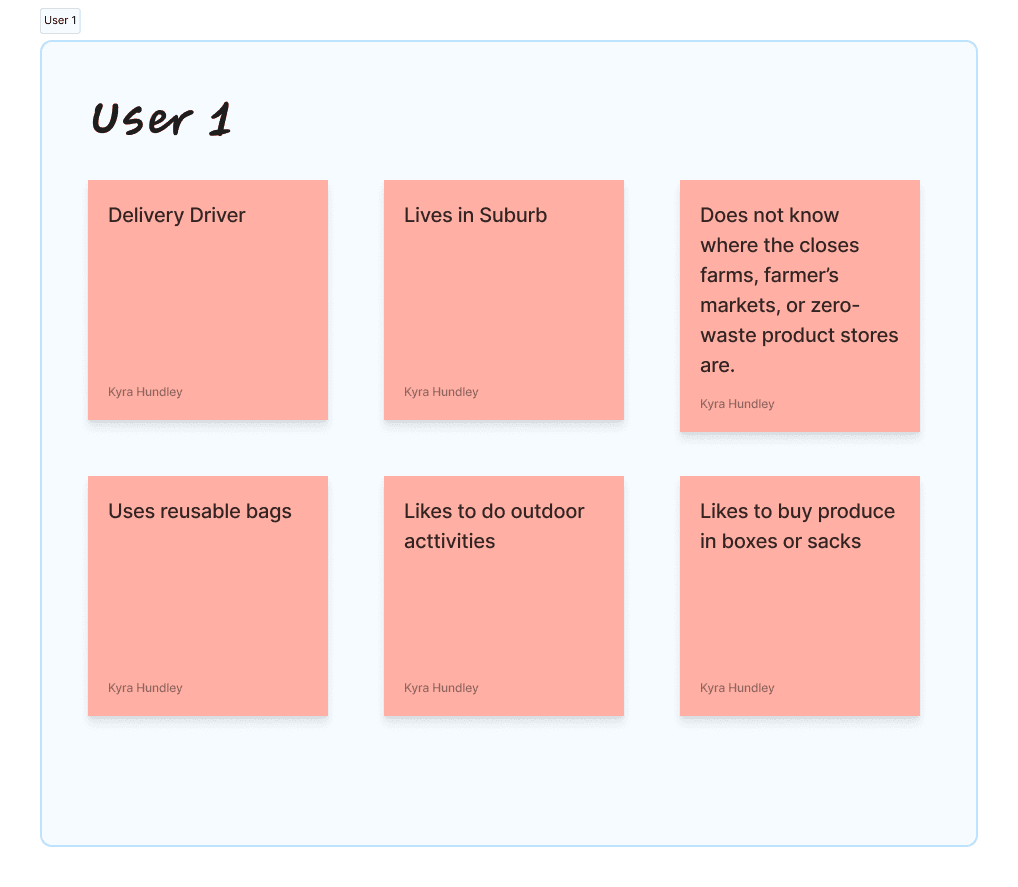
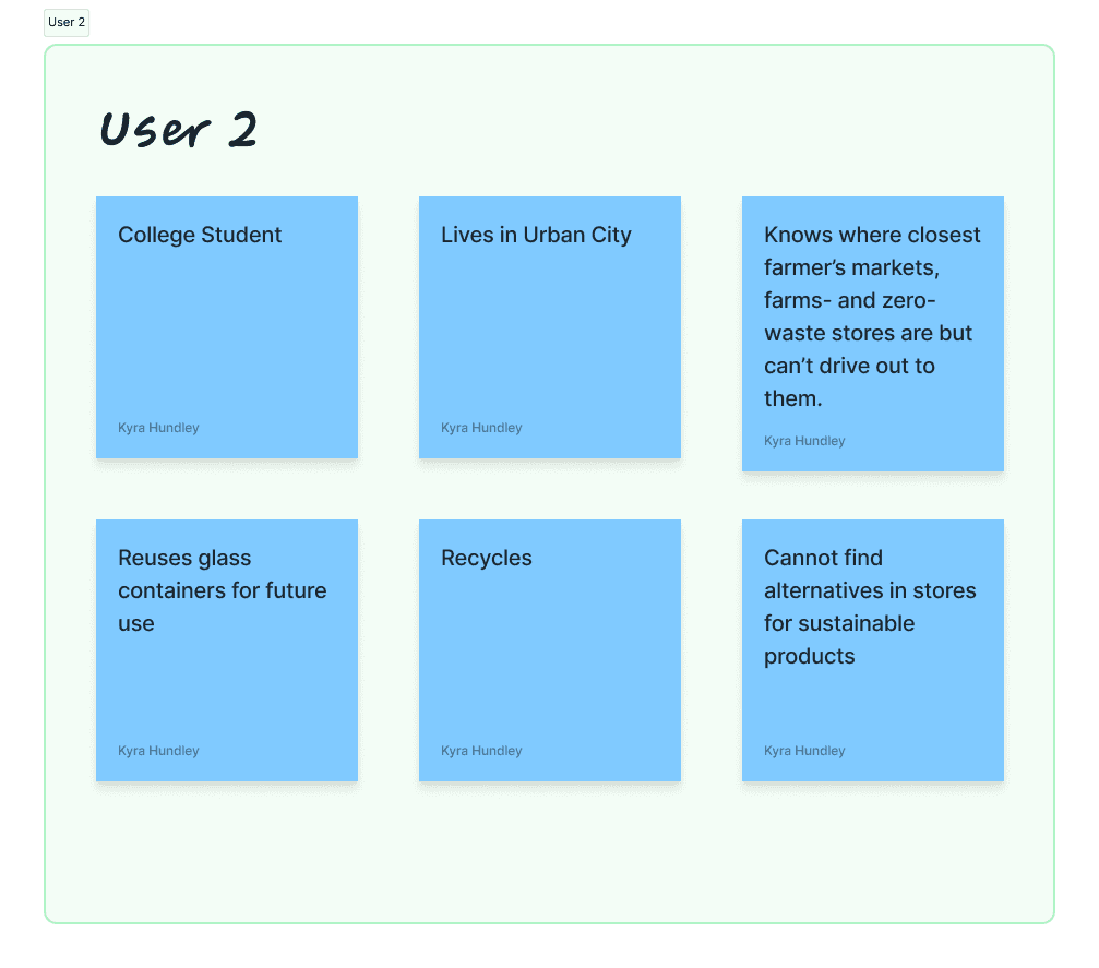
The interviews consisted of two participants found through UX community Slack channels who willingly completed a Google Form survey as a method of interview to delve into their viewpoints on accessing and purchasing farm-to-table products.
Through gathering insights from both the secondary research and user interviews, this project aims to inform solutions that improve the availability and accessibility of sustainable food sources, thereby strengthening the connection between consumers and farm-to-table goods.
Here are the main results from the interviews:
Direct connection with growers when buying from farmers
Local and fresh product appeal from farm-to-table products
Rural residents more aware of farm stands and PYO operations
Urban residents have easier access to farmers markets than originally speculated
Over 23 million Americans live in food deserts
Limited access to good grocery stores in food deserts
Common Findings:
Both users expressed interest in environmentally friendly practices, such as using reusable bags, recycling, and reusing containers.
They demonstrated a desire to access farm-to-table products and zero-waste options.
Differences:
User 1 lacks awareness of nearby sustainable shopping options and does not have specific access challenges.
User 2 is aware of local farms, farmer's markets, and zero-waste stores but faces limitations in transportation to these locations and struggles to find sustainable alternatives in regular stores.
The affinity mapping activity was conducted with the purpose of gaining valuable insights and organizing user data to inform the design process. By analyzing and grouping the collected information into five distinct categories, such as Pain Points, What They Like to Do, Sustainable Practices, Who They Are, and Where They Live, the design team obtained a deeper understanding of the users' needs, preferences, and challenges.
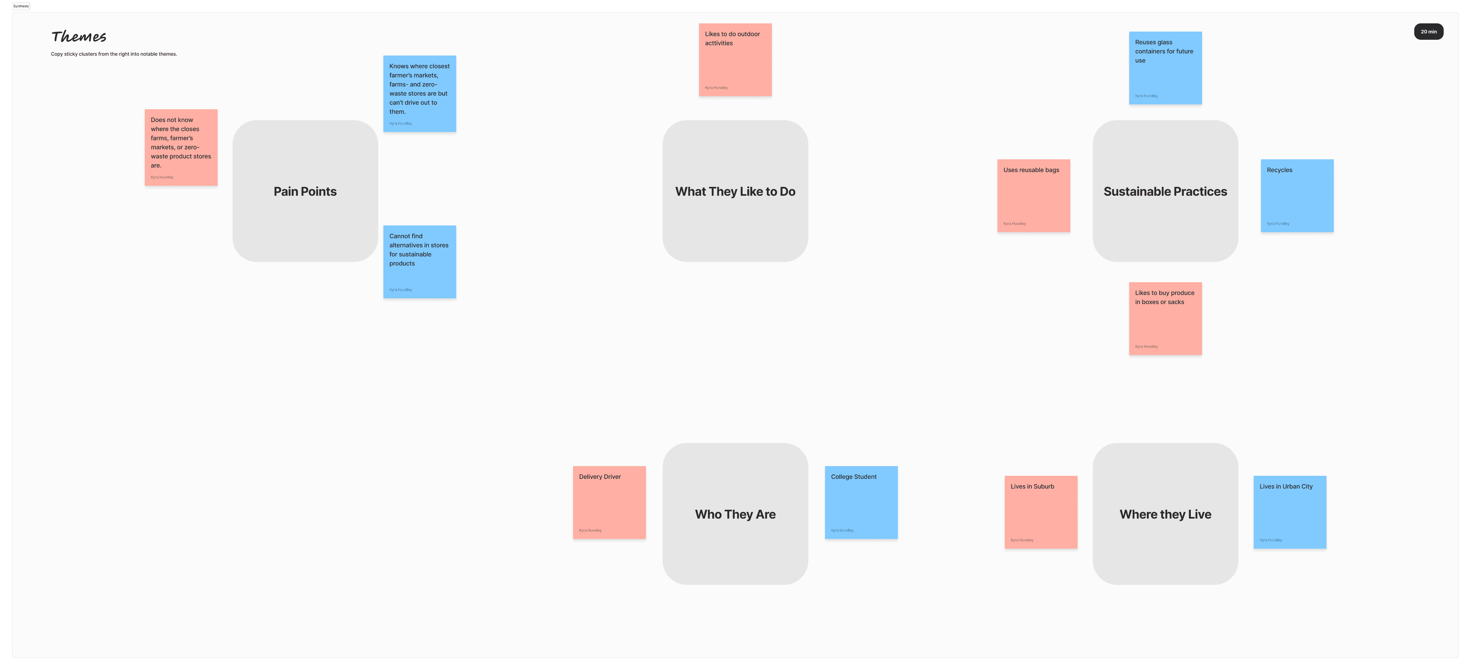
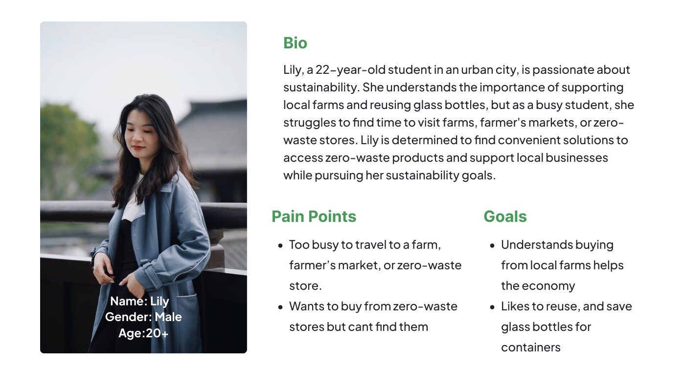
Given the time constraints of the hackathon, a decision was made to consolidate the primary and secondary research findings into a single persona that represents the common challenges and needs identified. The persona is characterized by a busy schedule and a desire for accessible options to obtain farm-to-table and zero-waste products. A key issue for this persona is the inability to drive out to farms due to time constraints. By focusing on these core challenges, I was able to develop solutions that address the persona's specific needs and make sustainable options more attainable within their busy lifestyle.
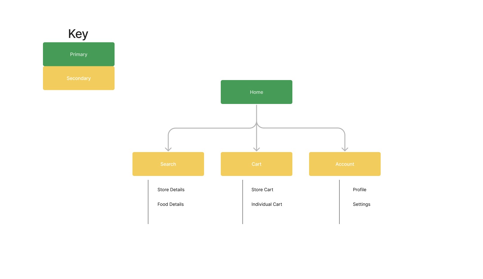
Creating a sitemap was a fun way to visualize information architecture the design process, enabling me to visualize the essential components required for the project. This strategic approach allowed me to establish a clear structure and hierarchy of information, providing a bird's-eye view of the entire project's content and navigation. Following a sitemap is essential in maintaining consistency and alignment with key features needed for solving user's needs.
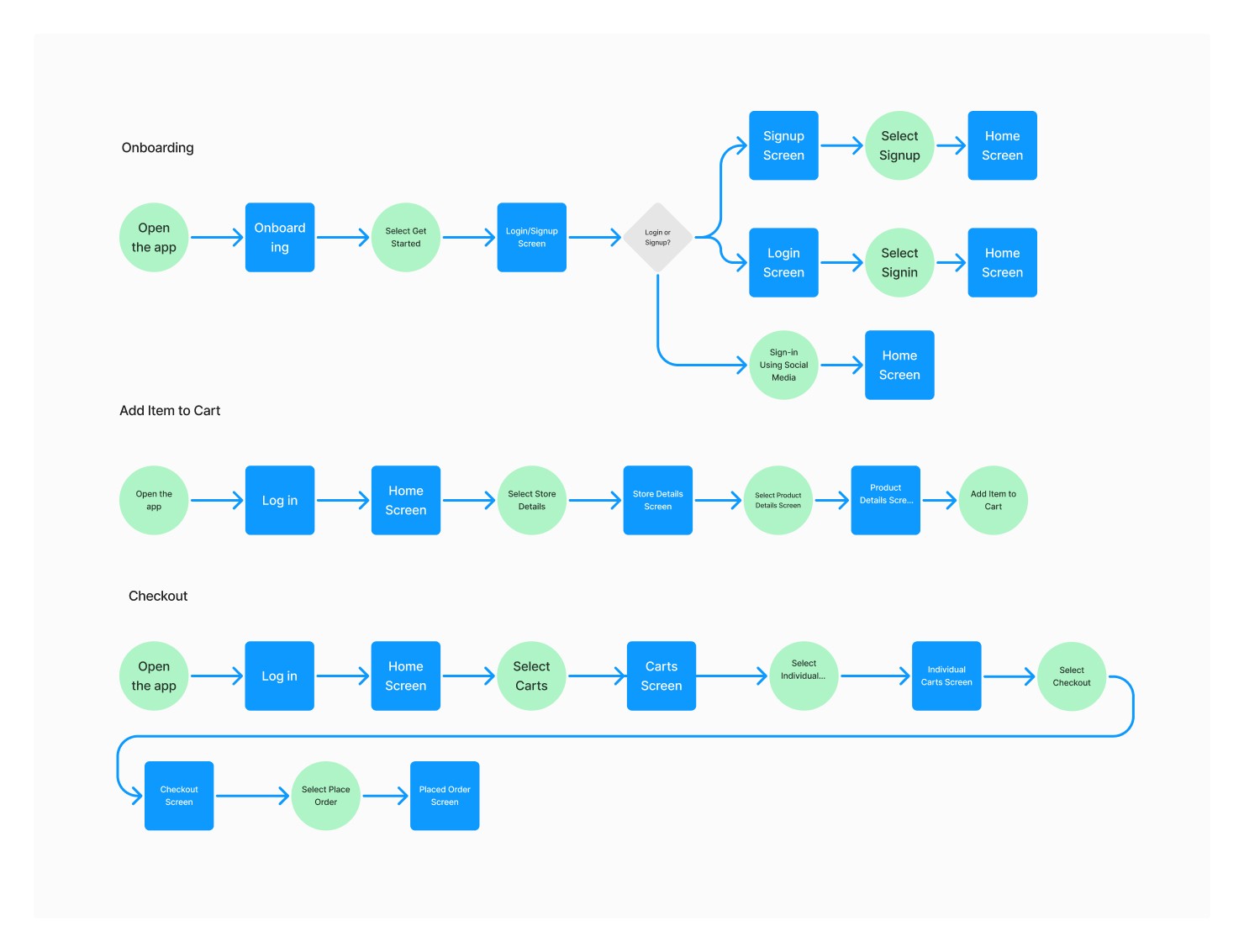
After creating a sitemap to establish a clear structure and hierarchy of information for the project, the next step was to develop user flow statements. User flow statements provide a detailed narrative of how users will navigate through the website or app, outlining their interactions, decisions, and the resulting actions at each step.
To create user flow statements, I examined the sitemap and identified the key pages, sections, and functionalities that users would encounter. I analyzed the logical sequence of these elements and envisioned the user's journey from start to finish.
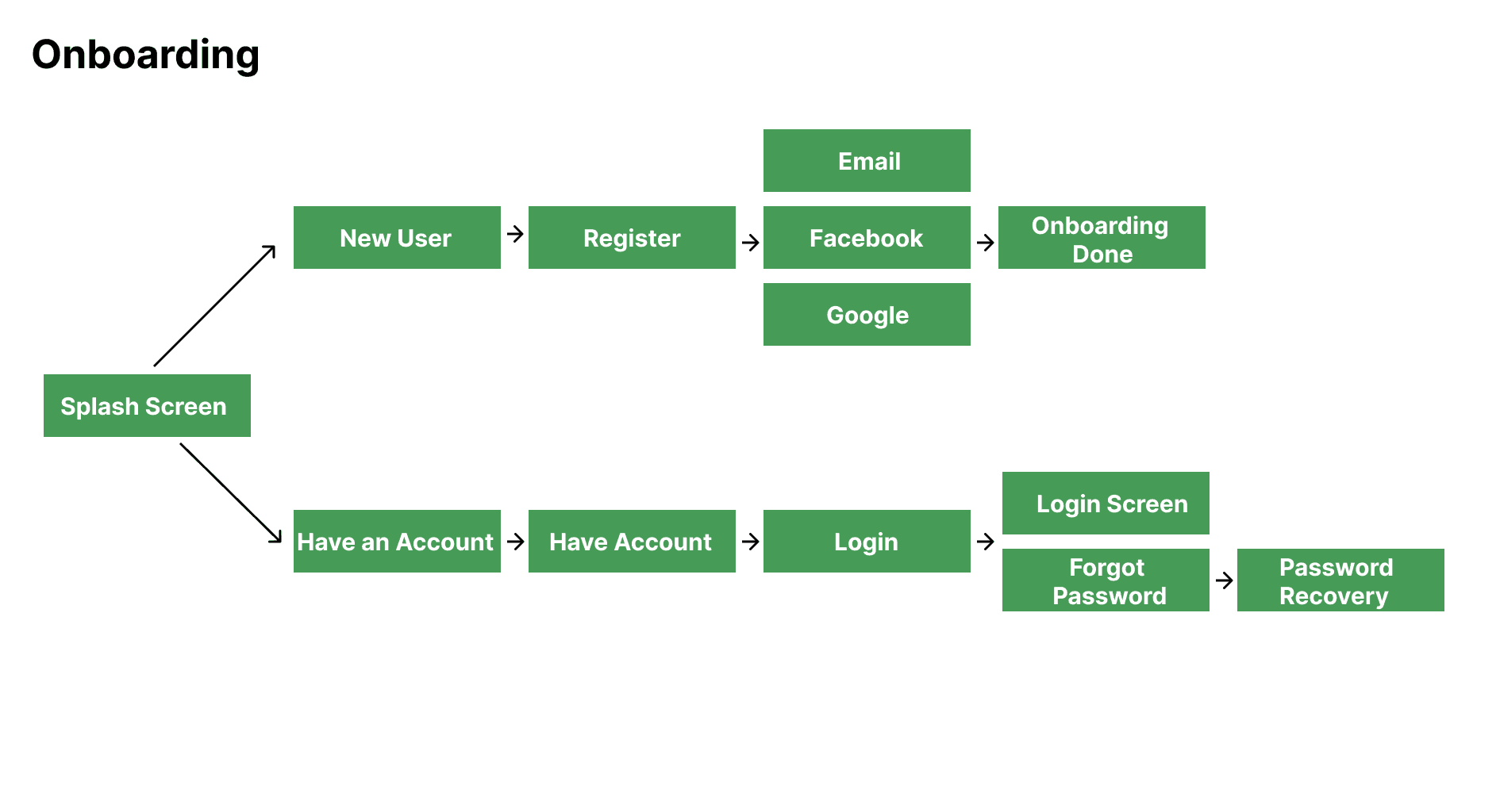
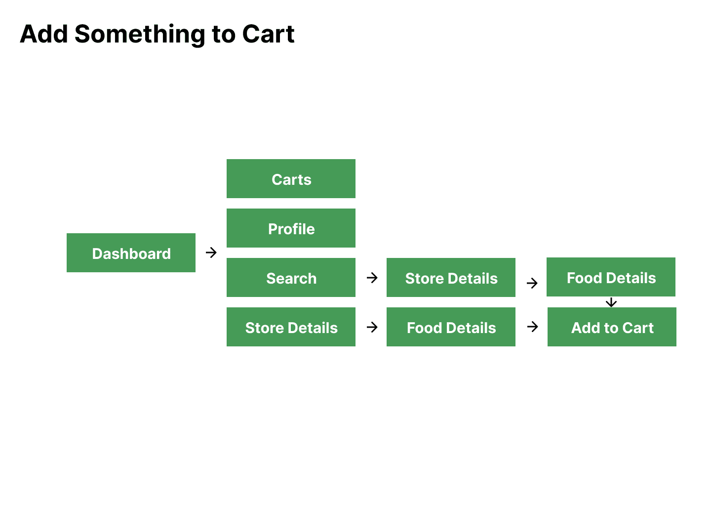
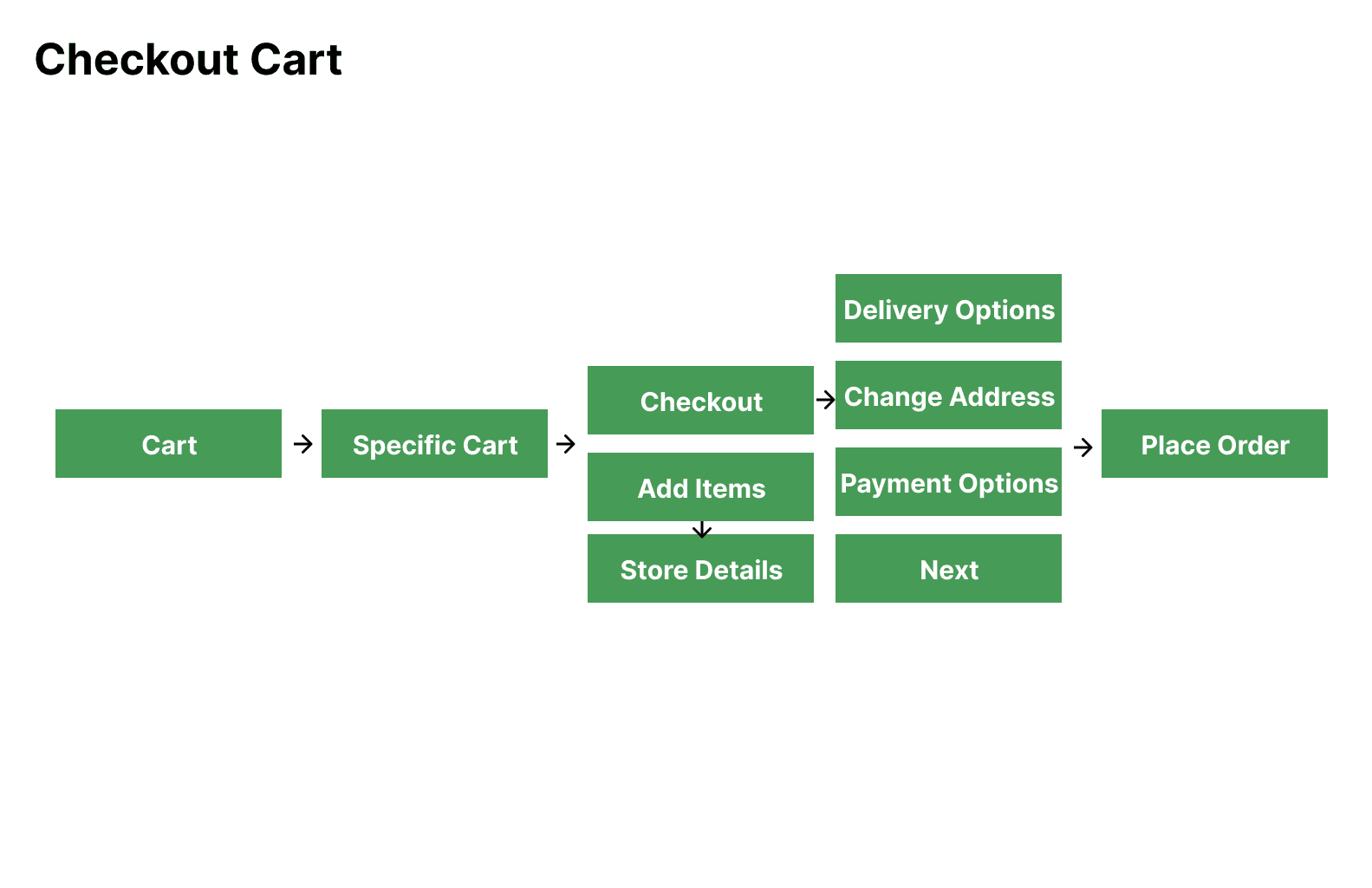
Following the creation of user statements, the next logical step in the design process was to develop a user flow diagram. This visual representation served as a valuable tool to guide me during the subsequent screen creation phase.
User flow diagrams provided a clear visual map of the user's journey, showcasing the interconnectedness of different screens, decisions, and actions. This visual representation enabled me to identify the specific screens that aligned with each user statement and distinguish them from decision points and actions within the flow.
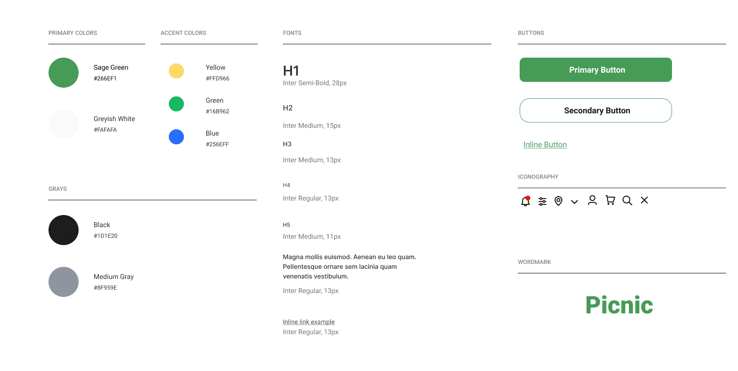
With a background in graphic design, I approached the UX process with anticipation, eager to delve into one of my favorite aspects: the creation of a style guide. This design activity held a special place in my heart, as it allowed me to combine my passion for aesthetics with the practicality of user experience.
The creation of a style guide had a profound impact on the overall UX process. It provided me with a platform to consolidate and communicate visual elements that would shape the user interface. By defining the color palette, typography, imagery, and other design elements, the style guide set the foundation for a cohesive and visually appealing user experience.
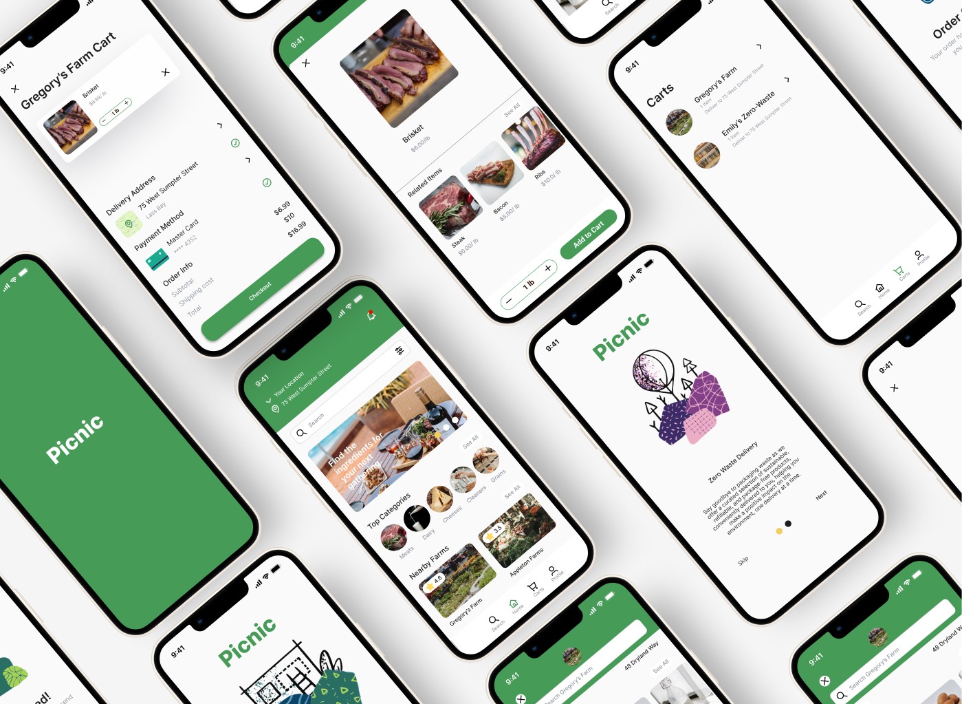
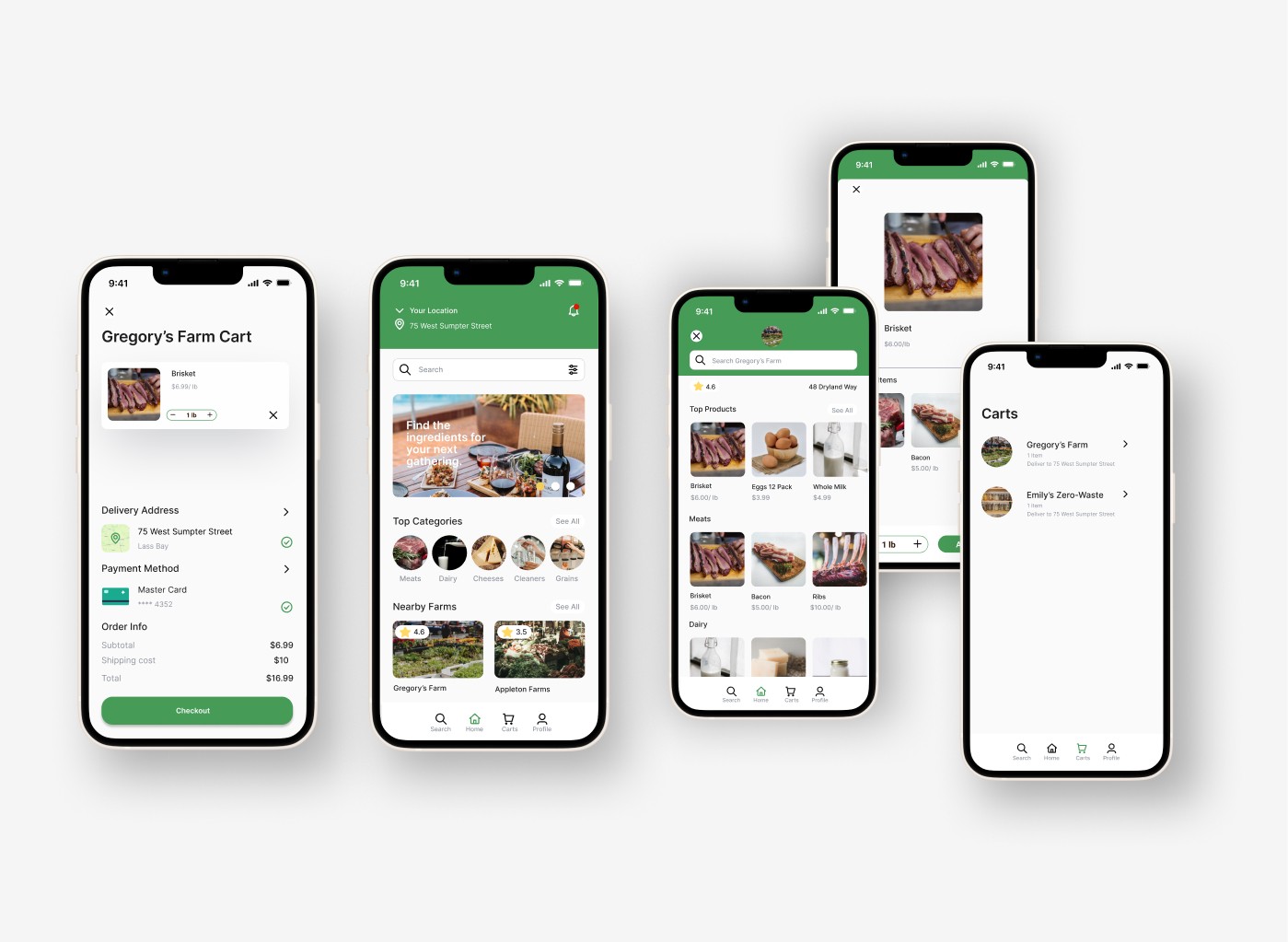
Towards the end of the second day of the project, I recognized the need to prioritize the UI development phase due to time constraints. In order to maximize efficiency, I made the decision to dive straight into creating high-fidelity UI designs while simultaneously exploring various ideas. This approach allowed me to utilize my time effectively and ensure progress in both the visual design and ideation processes.
By transitioning to high-fidelity UI development, I aimed to expedite the design process while maintaining a high level of visual quality. This decision was driven by the understanding that time was a limited resource, and it was crucial to make the most of it in order to deliver a polished end product.
Conclusion
Reflecting on the past, I realize the missed opportunity in crafting "How May We" statements and translating ideas into quick sketches. These steps could have deepened my understanding of user requirements and captured valuable insights. Embracing these practices would have led to a more user-centric design approach.
Moving forward, I am determined to enhance my design process for future hackathons and projects. This involves allocating ample time for user research, using techniques like "How May We" statements, and employing quick sketches to explore design possibilities. By prioritizing a better understanding of user needs, I aim to create solutions that genuinely address their pain points and aspirations.