#productivity
#mobile
#Figma
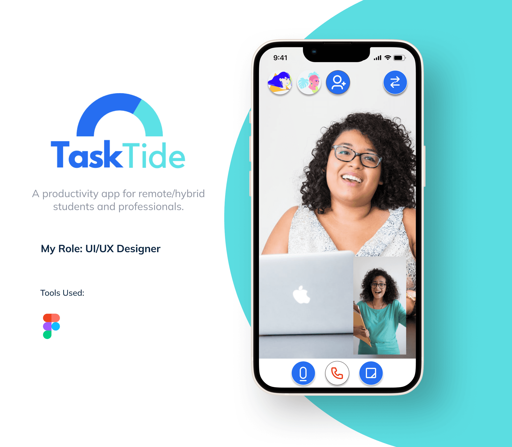
Figma
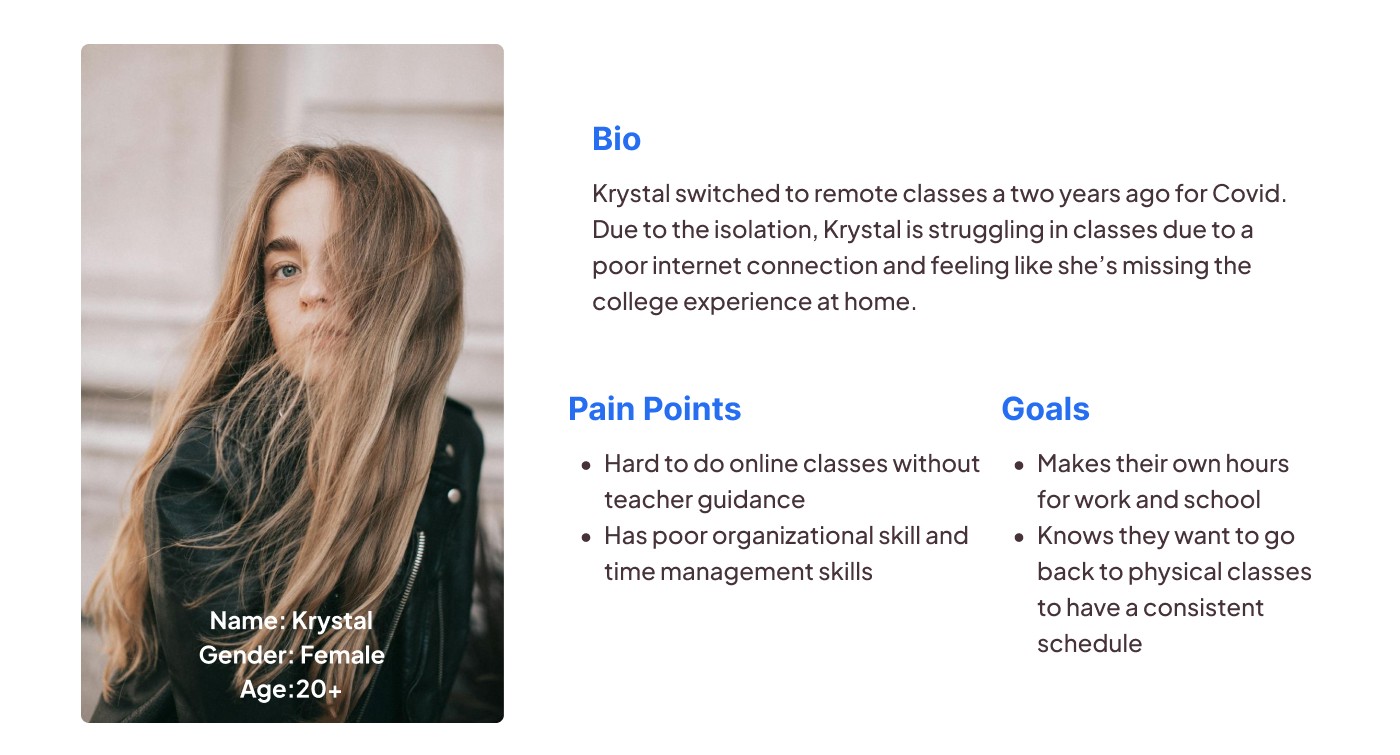
Through my secondary research, I discovered that a significant portion of college students felt that their high school education did not adequately equip them with organizational skills. This lack of organizational skills often results in difficulties in managing their time effectively. As a result, students found it challenging to balance extracurricular activities with their academic responsibilities, leading to decreased productivity and lower grades. Additionally, this lack of organization contributes to feelings of disorganization and makes it difficult for students to identify the necessary tools and resources to support their academic success.
"Students Need Better Time Management and Organization Skills"
"Students Not Using Available Technology to Better Manage Their Work"
"50% of students do not use a system to manage schoolwork " - Noria Corporation
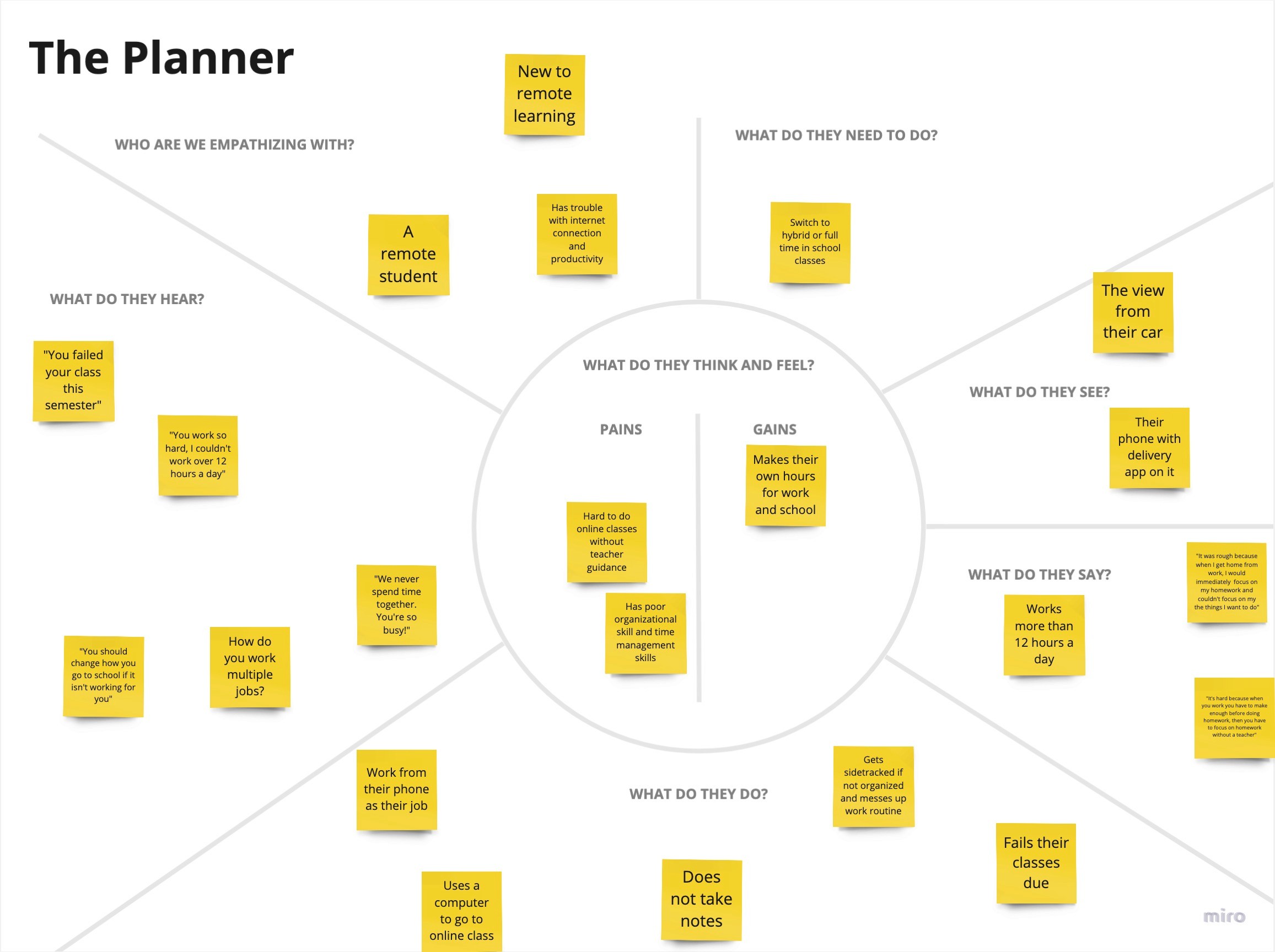
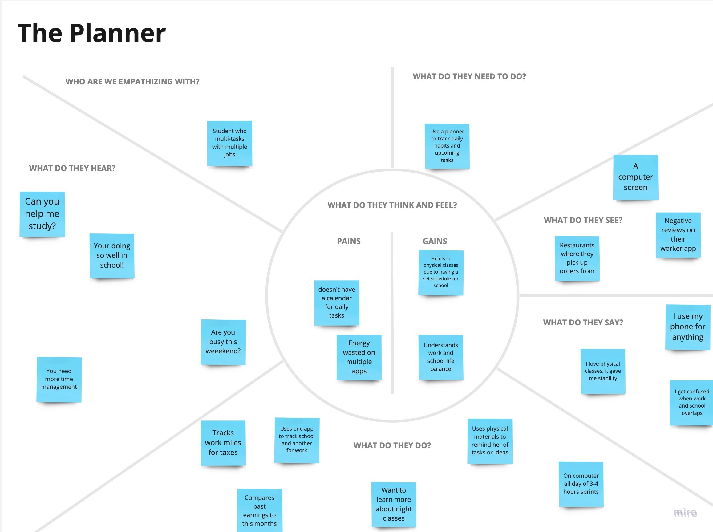
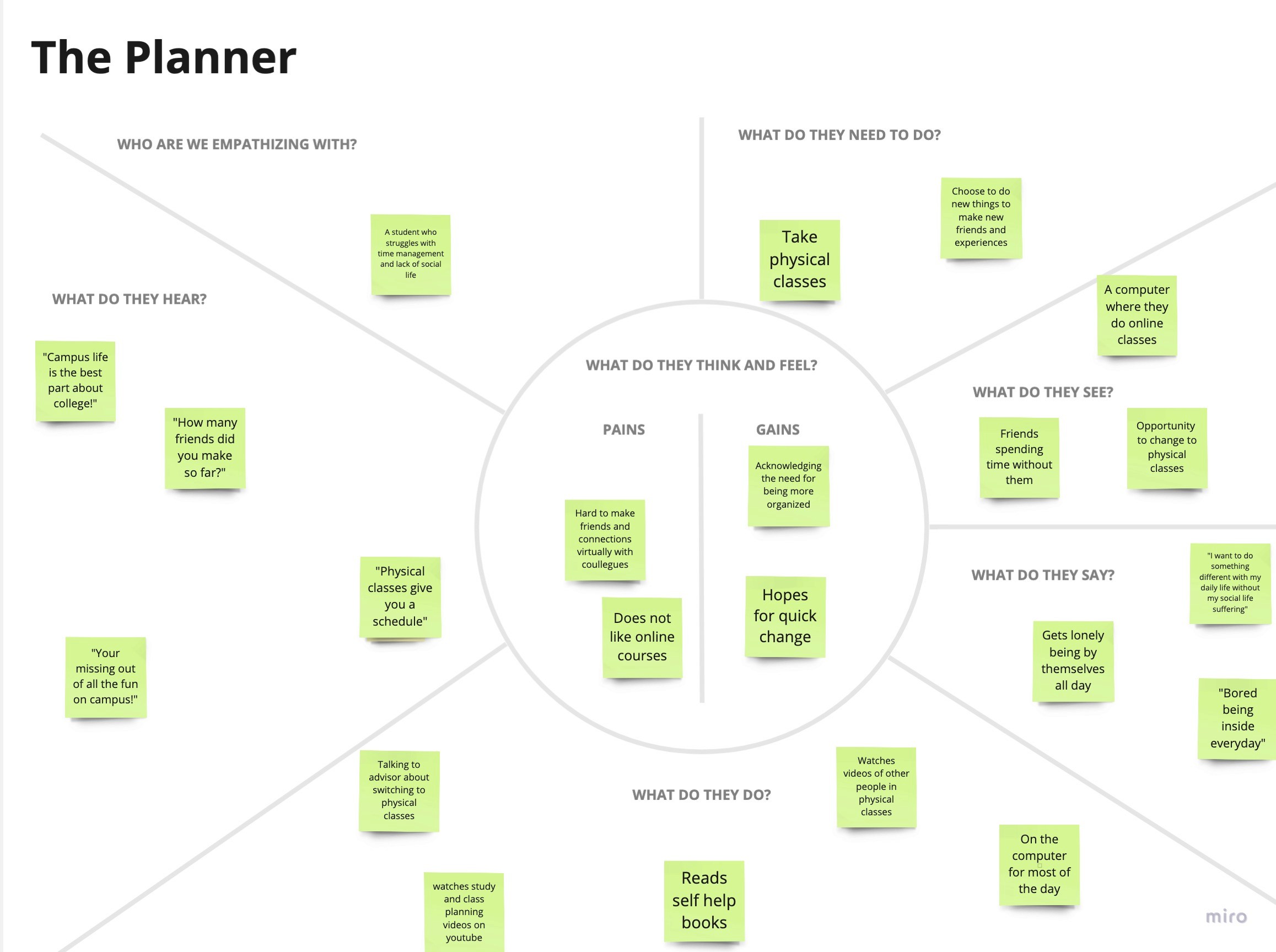
When designing the screener survey, the primary aim was to identify participants who possessed the following characteristics:
Experienced major change in the past year with relationships, career, living situation, death of loved one, and/or other
Have experienced feelings of insecurities with their accomplishments
Expressed interest in improving mindset/situation
Willing to stick to a routine
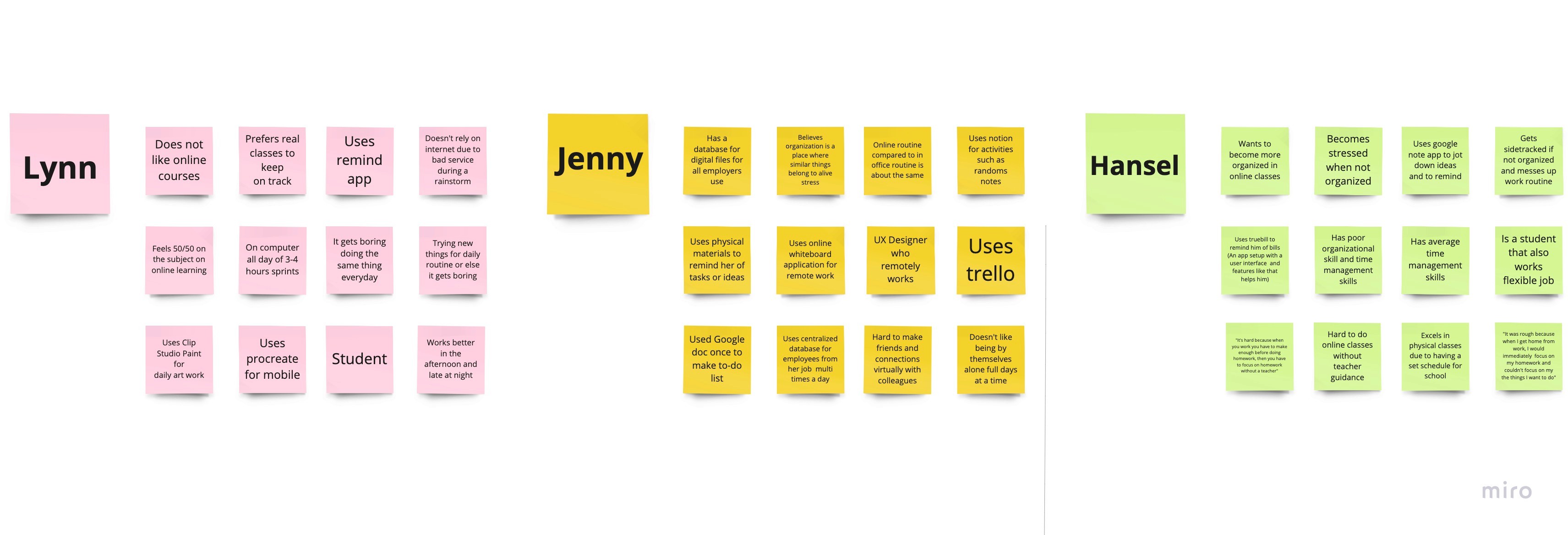
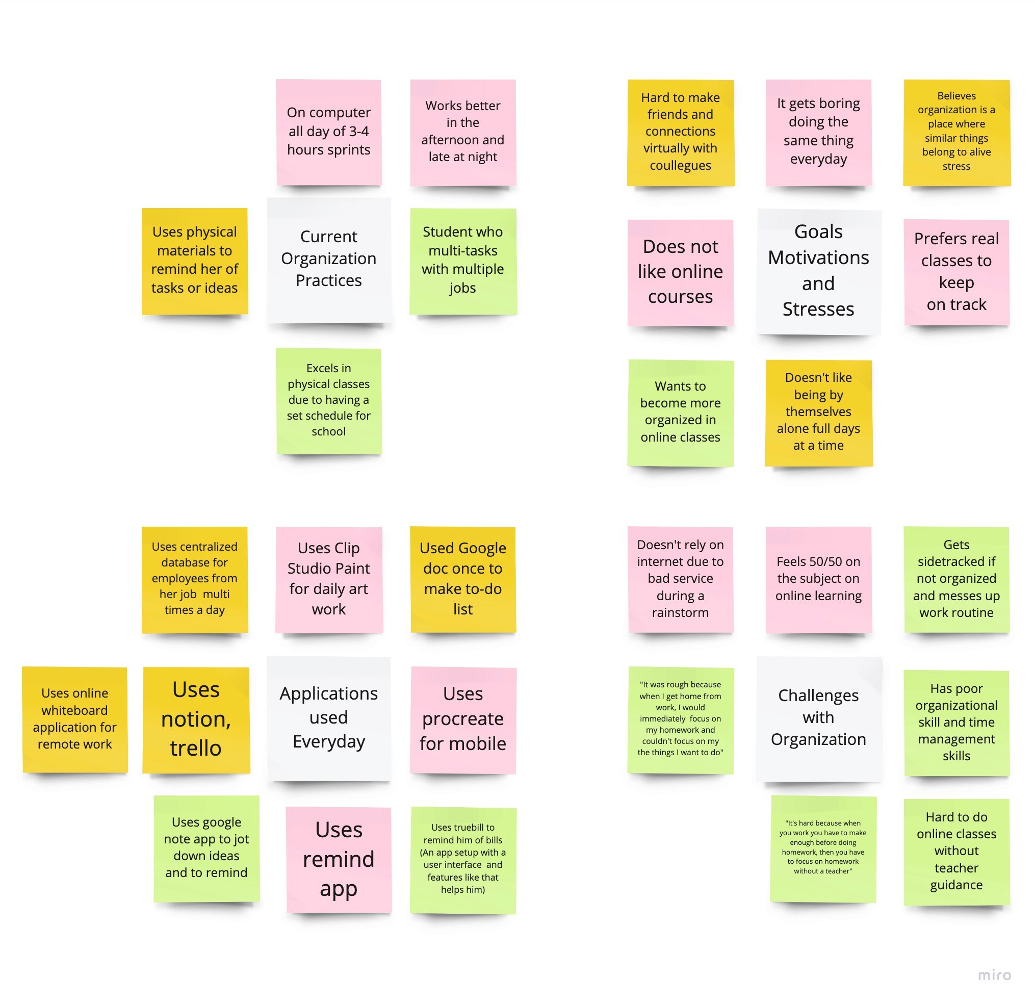
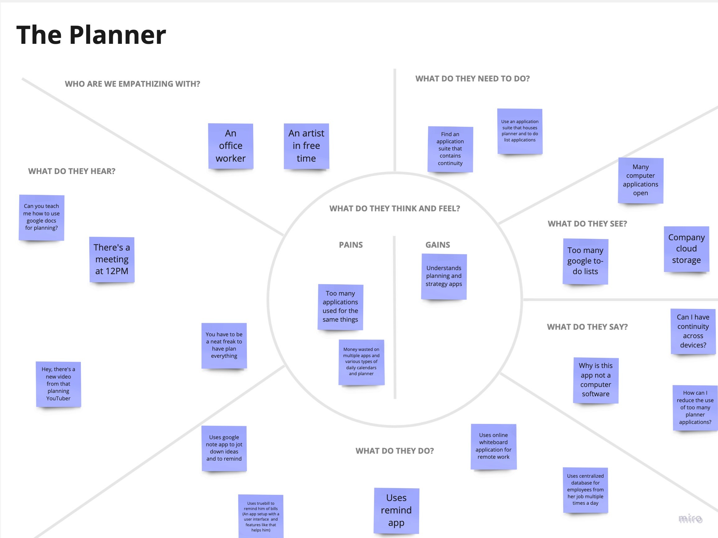
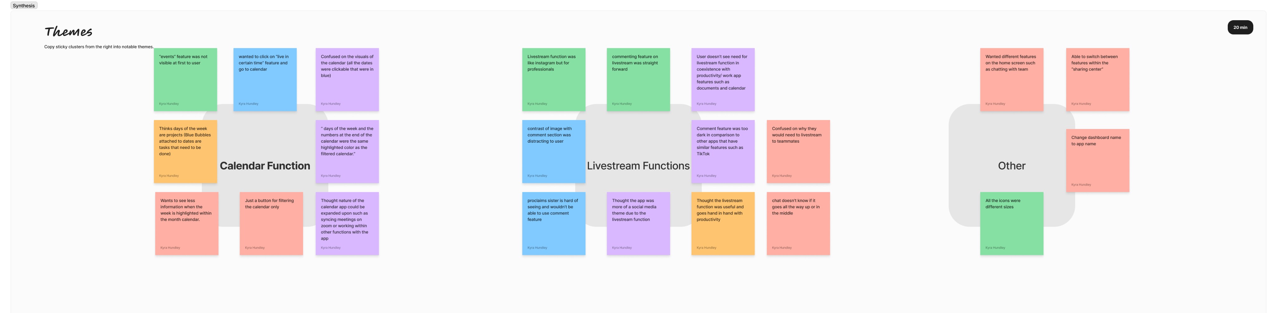
Through a meticulous analysis of the interview notes and careful organization of the thoughts and responses provided by the participants, I identified four prominent themes that emerged from the data. These themes encompassed the following aspects:
Current Organization Practices
Goals, Motivations, and Stresses
Applications Used Everyday
Challenges with Organization
The purpose of completing this design activity was to gain a deeper understanding of user needs and preferences, informing the design process. By incorporating user insights, the impact was a more user-centered design, addressing pain points and creating a satisfying user experience.
The design activity focused on understanding the motivation behind its completion and evaluating its impact on the design process. To achieve this, I utilized the previously generated HMW statements during a brainstorming session. These statements served as a foundation for creating idea sketches that explored potential features for the app. By visually representing these features, I was able to compare them to the findings from user research, gaining valuable insights.
To uncover potential functionalities for my productivity app catering to remote/hybrid students and professionals, I utilized user stories. Through careful analysis of these stories, my objective was to optimize user productivity and improve their workflow. This systematic approach allowed me to identify and prioritize the essential features that should be incorporated into the app's design.
As a user, I want to:
As a teacher, I want to have all my documents in one place and be able to view them on my calendar for easy organization and access.
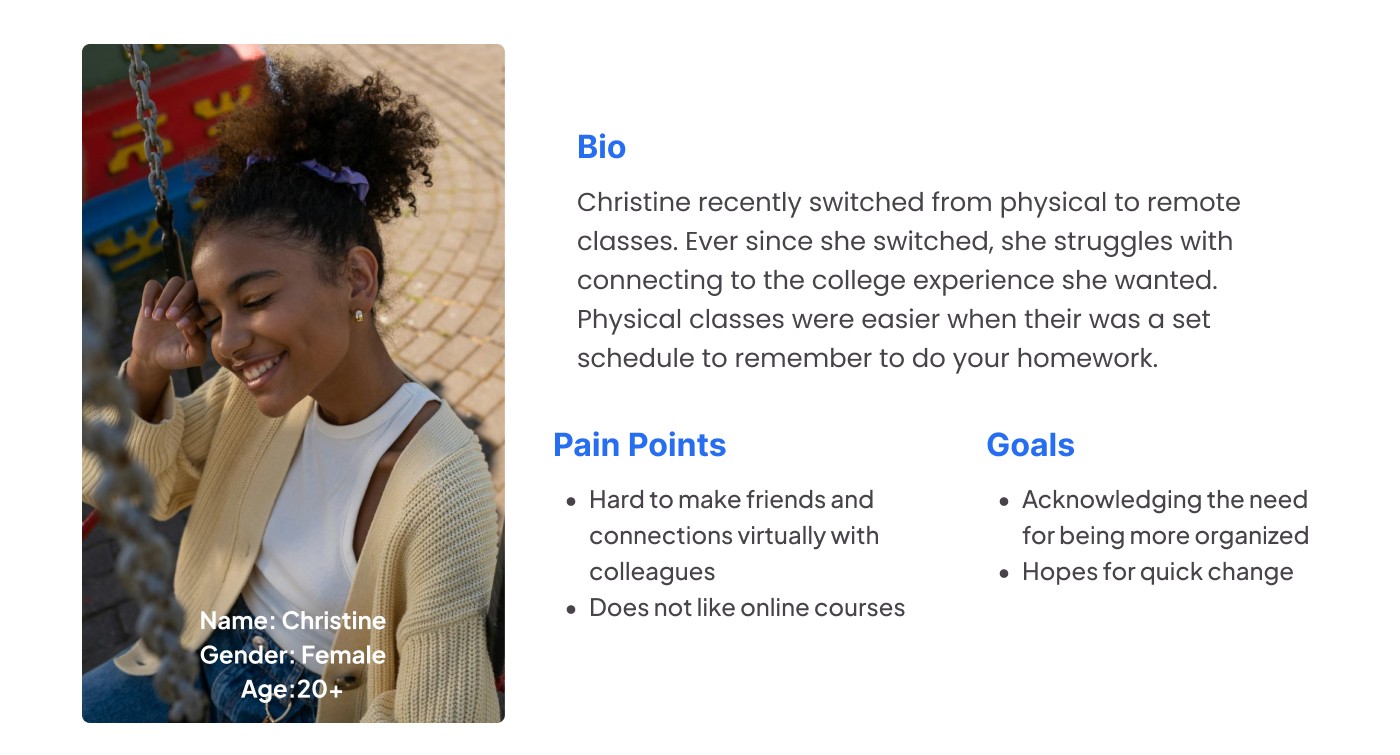
As a remote student, I want to actively participate in my online classes and engage with my classmates in a manner similar to physical classes.
As a student, I want the flexibility to log in using either my student ID or student email, without relying on my personal email.
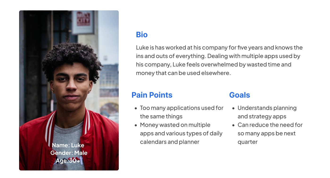
As a marketing manager, I want to minimize using too many apps that do the same tasks to increase productivity.
As a marketing manager, I want to easily socialize with my coworkers on projects online, regardless of different working hours, to ensure uninterrupted team productivity.
To uncover potential functionalities for my productivity app catering to remote/hybrid students and professionals, I utilized user stories. Through careful analysis of these stories, my objective was to optimize user productivity and streamline their workflow. This systematic approach allowed me to identify and prioritize the essential features that should be incorporated into the app's design.
I completed the design activity of identifying and delineating user flows by employing my sitemap and addressing the "How Might We" (HMW) questions. The purpose was to create a user-friendly and comprehensible experience for the app. This activity had a significant impact on the design process as it guided the evolution of the design by aligning it with the identified user flows. By understanding the specific steps and needs of users, I was able to make informed design decisions and create a more intuitive and streamlined user experience.
Go to Another User's Meeting
Comment on Another User's Project
Filter Calendar to Show Weekly Projects Only
The ability to hand sketch my user flows granted me the opportunity to breathe life into them, resulting in a design that exudes simplicity and a sense of ease. It provided me with a platform to explore diverse ideas and envision the functionality of the app's features with enhanced clarity.
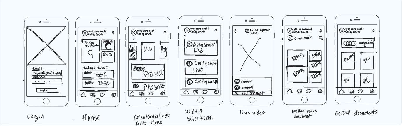
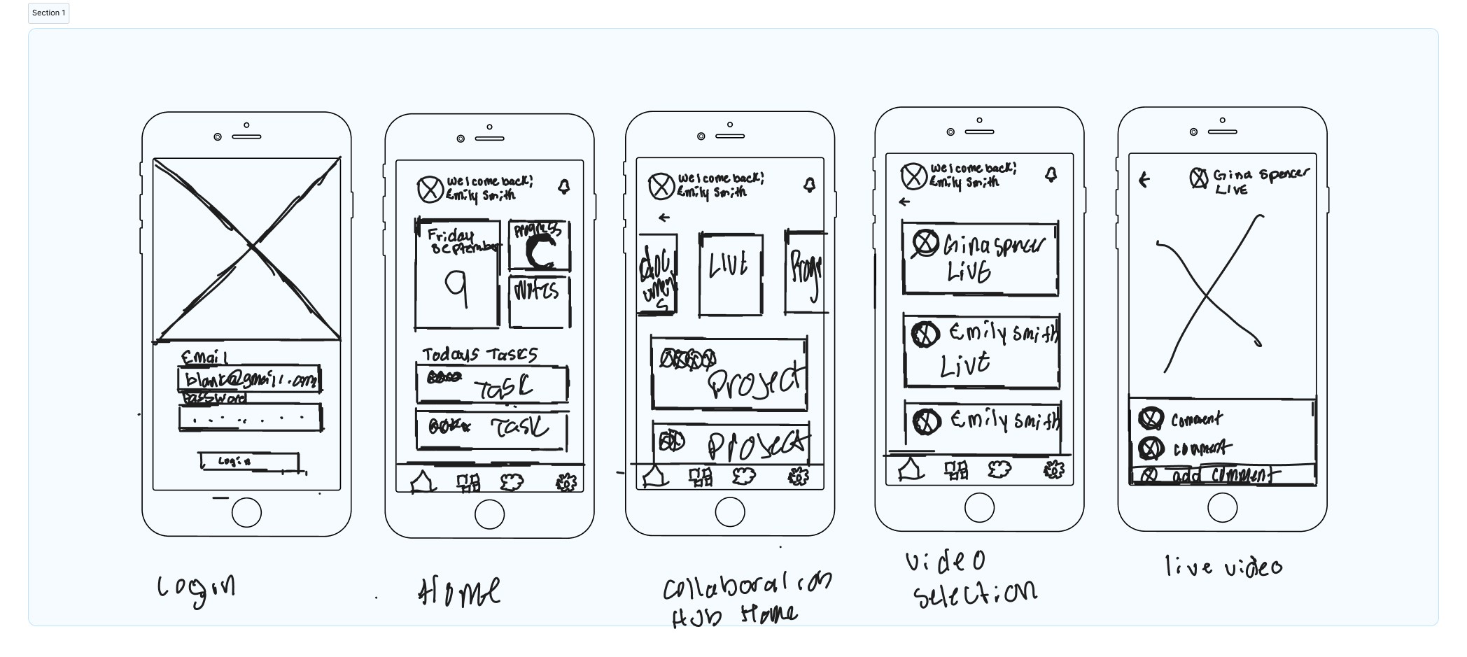
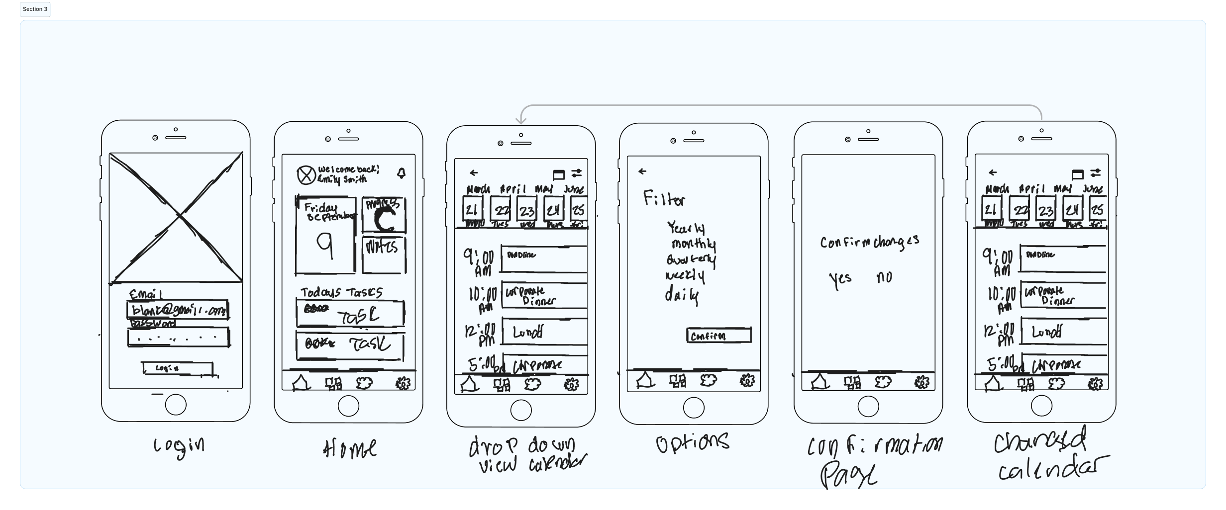
Converting initial sketches to low-fidelity wireframes in Figma was crucial for refining and improving the design process. This allowed me to optimize spacing, sizing, and layout while easily incorporating new features.
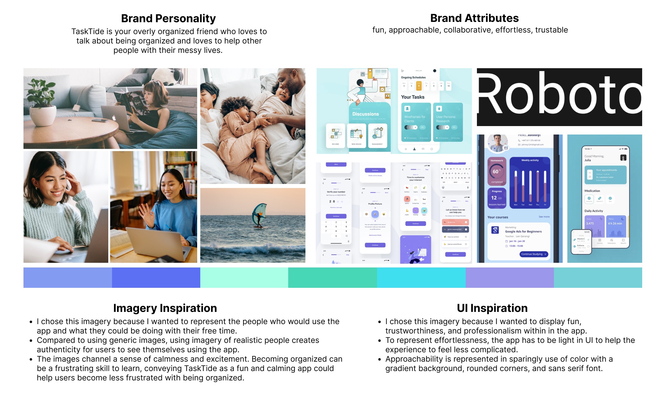
I developed a mood board as a visual representation of the desired look, feel, and aesthetic for TaskTide, following the guidelines of the brand platform. By aligning the design with the brand's personality and attributes, the mood board ensured consistency and coherence in conveying the brand's essence. The goal was to create a calming and positive user experience that resonated with the brand platform, establishing a strong connection between the product and its intended audience.a
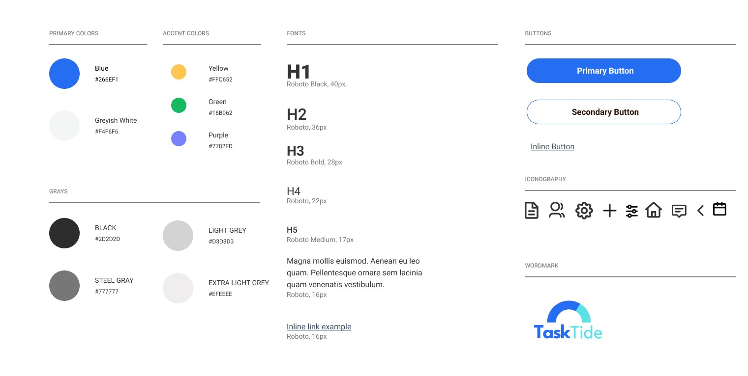
Completing the design activity of creating a style guide was driven by a deep understanding of the importance of cohesive aesthetics and its impact on the overall design process. As a designer, I recognized the need to establish a unified visual language and consistent style for the app to enhance user experience and convey a strong brand identity.
The primary reason for undertaking this design activity was to provide clarity and guidance to myself when creating high fidelity wireframes in the future. By documenting the preferred typography, color palette, layout principles, iconography, and other visual elements, the style guide acted as a comprehensive resource that ensured consistency across different screens, features, and interactions within the app.
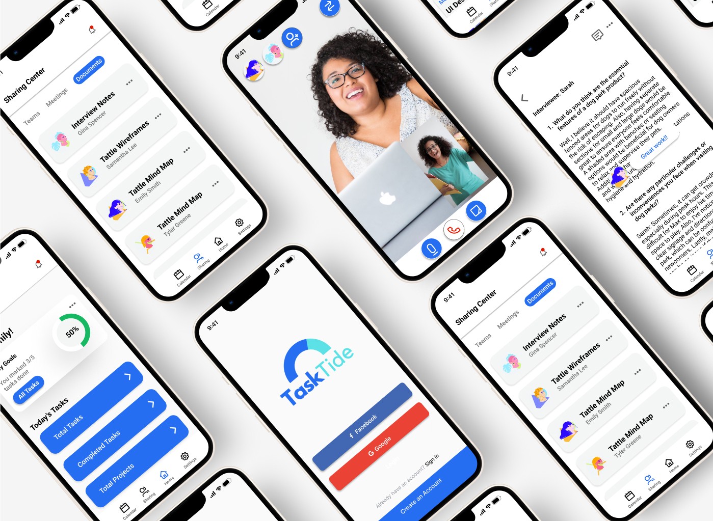
By integrating my mood board and style guide, I harmonized all elements and guided the creation of my high-fidelity screens. Noteworthy alterations encompassed the following:
Moving the profile icon from the navigation bar to the top right corner of the homepage
Replacing the hamburger drop-down menu with a bottom menu on the screens
Creating rounded-rectangular call-to-action buttons
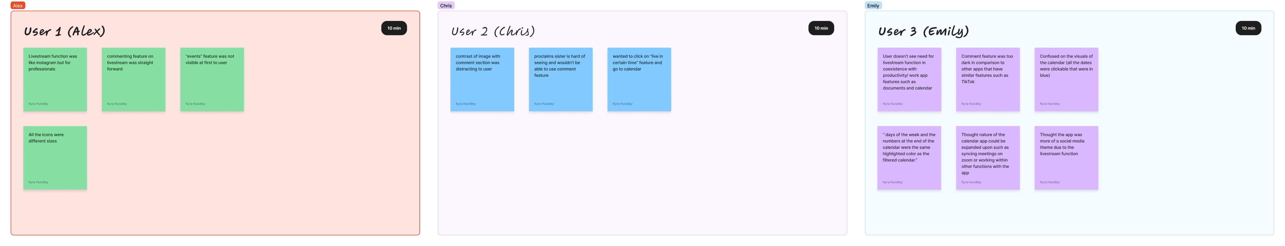
I was testing the reactions to the app TaskTide from the user’s perspective. There were 5 remote participants used in the testing session. Some were recruited by Avocademy’s Slack channel (1 user), one was a friend (1 user), and some were random encounters I made while on the app Monkey (3 users). I was hoping to discover that the app was easy to navigate, the tasks were understandable to the users, and the users had little problems with the calendar function.
Gain insights into users' impressions of the screens, layout, and overall design, gauging their overall experience and perception.
Observe the time taken by users to navigate through the main features, assessing the efficiency of the app's usability.
Monitor the occurrence of errors made by users during task completion and measure the time taken to resolve those errors, providing insights into the app's error handling and recovery capabilities.
Identify potential usability pain points, areas of confusion, and opportunities for improvement within the product.
The tasks included:
Comment on Another User's Project
Filter Calendar to Show Weekly Projects Only
Go to Another User's Livestream
In general, users reported a smooth and positive experience while navigating the app, appreciating the straightforwardness of the design. Additionally, users offered valuable feedback highlighting areas for improvement. During the usability test, we identified a total of three issues: one major problem and two minor ones.
3/5 Users were confused as to why a livestream function was needed on a productivity app or the livestream app confused the app as a social media app
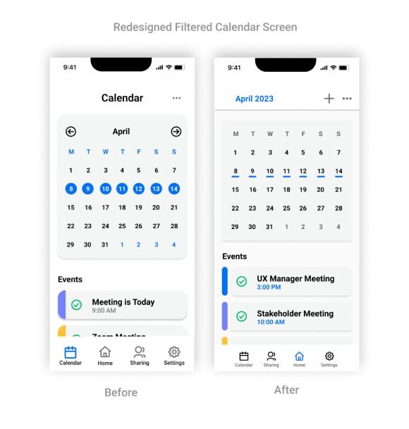
2/5 Users were confused with the color of the filtered calendar in conjunction with the already blue days of the week, and next months dates and hindered their ability to process highlighted dates as filtered dates
2/5 Users were confused with the color of the filtered calendar in conjunction with the already blue days of the week, and next months dates and hindered their ability to process highlighted dates as filtered dates
Addressing these problems is essential as it directly impacts user satisfaction and enhances the overall user experience, resulting in increased user retention and engagement. In order to resolve these issues, I have formulated the following solutions in the redesign and new prototype:
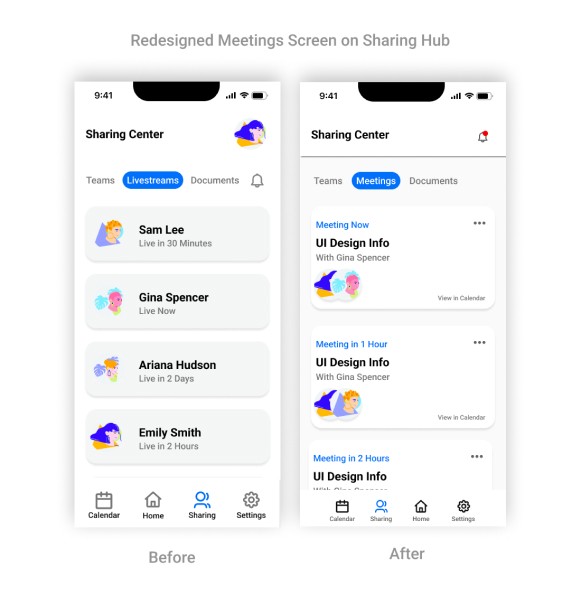
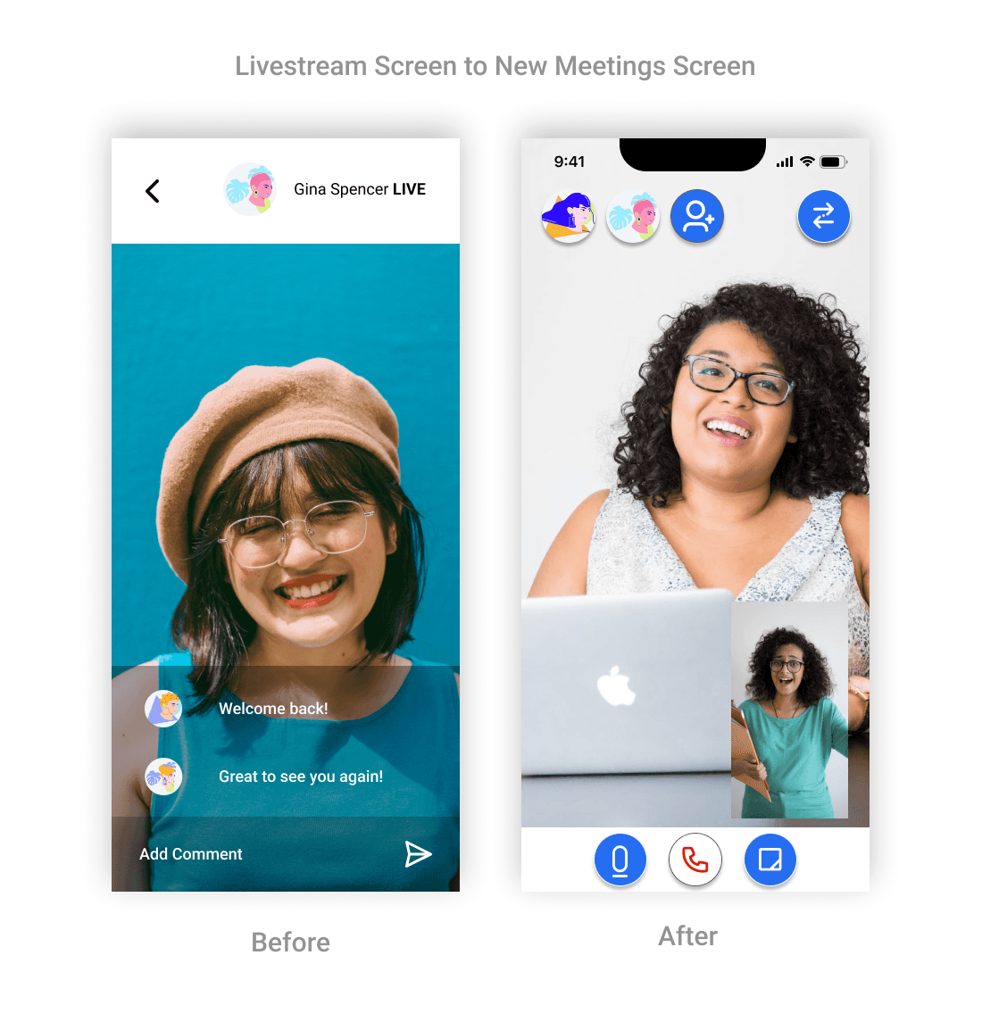
Task: Go to Another User's Livestream
Incorporated key elements such as a two-screen view displaying video feeds of both participants in a call
These improvements aimed to ensure that users perceive the function as a video call rather than a livestream.
Bringing a new dimension to user experiences and interfaces.
Addressed user concerns regarding visibility and create a more visually appealing and user-friendly meeting interface
Ensured that user avatars and icons are more prominently displayed, making it easier to identify participants.
Bringing a new dimension to user experiences and interfaces.
Highlighted "filtered" dates by underlining them in blue, providing a clear visual indicator of their distinction from regular dates.
Implemented a redesigned calendar interface where the month name is highlighted in blue, indicating it as a clickable date.

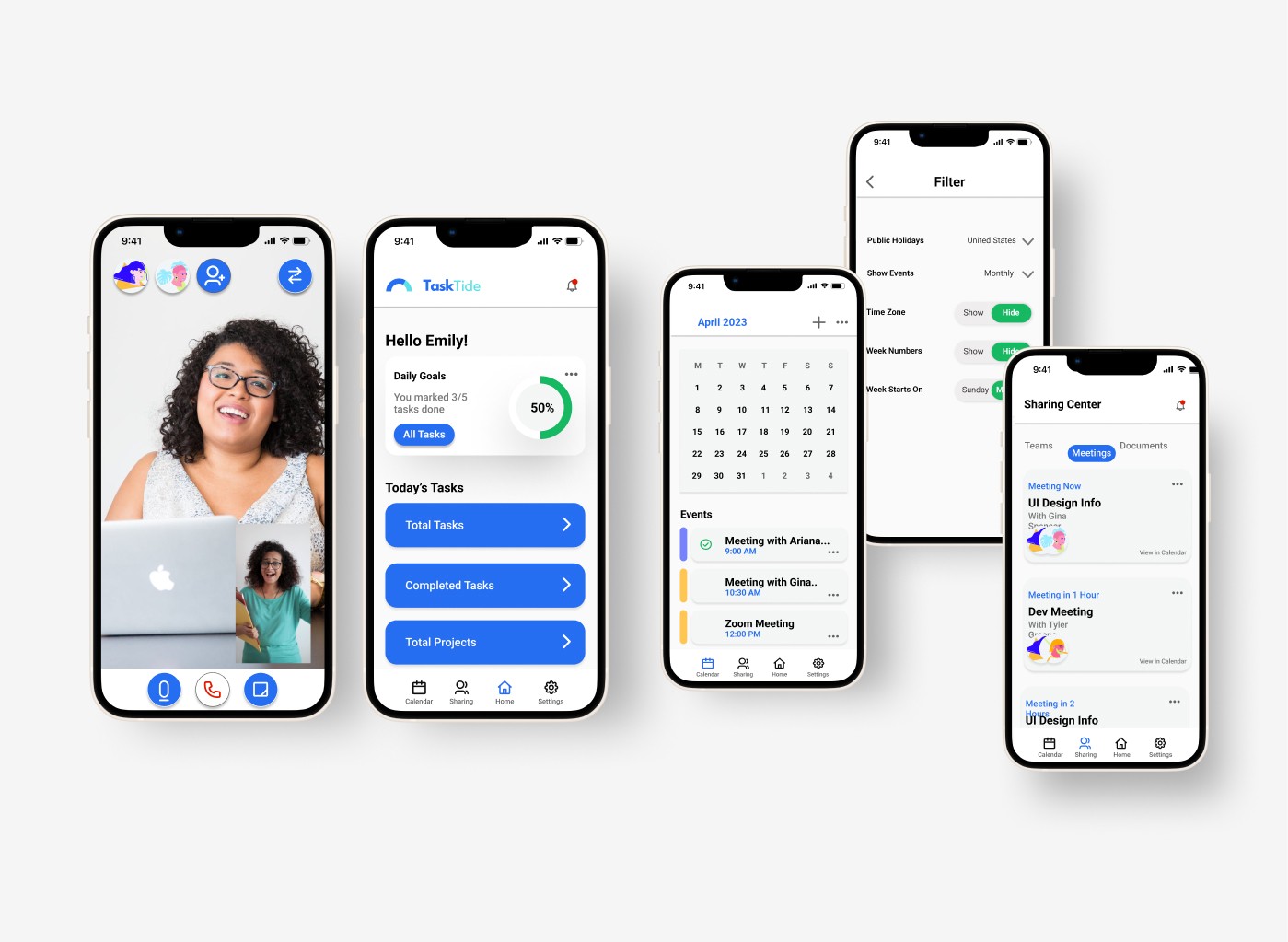
Based on valuable feedback from the usability test, I made diligent modifications to enhance the design of the app. These updates were aimed at creating a more refined and user-friendly experience, aligning with the received feedback. The constructive critique provided valuable insights that played a pivotal role in refining the final iteration of the app.
The following updates have been implemented to address the identified issues identified during user testing:
The app's overall aesthetic has been revamped to prioritize user-friendliness, allowing for easier access to a broader range of information.
The calendar function has been revamped and integrated into the app, including features like "view in calendar" within the meetings function.
To reduce distraction, the filtered calendar function in the app underwent changes to minimize the prominence of the blue highlights.
The livestream functionality has been transformed into a meetings feature.
Conclusion
Through my project TaskTide, I experienced significant growth as a UX designer, gaining a deeper understanding of the decision-making process and the importance of accessibility and continuous revisions. One key takeaway was the value of prioritizing accessibility throughout the design process. Additionally, I learned the significance of continuous revisions to deliver a high-quality product. Positive feedback from a usability test participant further motivated me to excel in UX design.